
By Courtney Reeser
When done right, it can capture many levels of information within a few shapes, curves and lines.
The best brand symbols, or logos, are reductive in nature. They are simple, straightforward and clear.
They capture either the nature of the company's business offer or the spirit of their brand promise. And in rare cases, both.
Essentially, brand symbols are a visual shorthand for the company.
Of course, the symbol in itself rarely tells the entire story, but over time with the supporting communications, it gains meaning and can ultimately represent the essence of what the brand stands for, whether it’s a way of life, a mission of excellence, or a standard of quality.
It can attract consumers, inspire fans, assure investors, and even provide a sense of belonging and connection to something greater than one's self.
The following are some of my personal favorites. Despite the design variety, uniqueness and depth of meaning of these symbols, they are share one common trait. Simplicity.
“Out of intense complexities, intense simplicities emerge” Winston S. Churchill
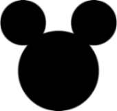
Disney
A beautifully reductive symbol.
Essentially three circles that represent the beloved Disney character.
Disney theme park designers often "hide" the symbol in the landscape of rides, attractions and other locations within the Disney theme parks.
Recognized around the world by children and adults alike this symbol has endured since 1930.
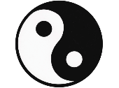
Yin Yang
The Chinese Yin Yang symbol represents perfect balance. Indeed, the whole of Chinese philosophy stems from the concept of Yin and Yang. The symbol captures the idea of opposites interacting and harmonic balance. Despite its Chinese origins, people of all cultures are able to immediately grasp the meaning of this elegant symbol.

Time Warner
Sound and Vision. This symbol captures the very essence of the Time Warne Cable offer - visual and audio entertainment. Very seldom to we see a symbol that so succinctly communicates what a brand stands for. One of my favorites.

Target
A wonderful "non-verbal" identity. Is this a perfect designed symbol? Perhaps, but it's real beauty is a result of flawless execution and integration into Target's advertising, graphics and signing. The "target" is such an integral component Target's communications, that it has taken on a singular power that few symbols ever achieve.

Apple
Clean and concise, this symbol is used as a "non-verbal" identifier for Apple products and the company. The beautiful details of the leaf and "bite" create personality and delight in a symbol that has taken on cult-like proportions. Simple, but certainly not boring.